
Introduction: It's 4 O'clock Somewhere Clock


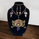
When I was young, I used to hear the saying "It's 4 o'clock somewhere" all the time. It meant it was tea time, or time to take a break. There's also the saying "It's 5 o'clock somewhere" which means it's quitting time or time for a cold drink. In any case, both mean it's time to just sit and relax a bit.
One of the craziest clocks I've ever seen is that one where the numbers have all fallen down to the bottom and it says "Whatever" on the clock face. I always laughed at that one. These days, we really don't use analog clocks as much, so we might as well have fun with the design. With that in mind, I thought it would be funny to make an "It's 4 o'clock somewhere" clock where all the numbers are 4.
Supplies

Materials
- 5mm Baltic birch or other light colored wood (hardboard and MDF will NOT work for the top layer)
- Cutting file (included below)
- Coloring page (included below)
- Wood stain
- Polycrylic spray (clear satin finish)
- Sublimation paper
- Heat-resistant tape
- Butcher paper
- Glue (Wood glue, Tacky glue, or something stronger if you prefer)
- Clock kit
- One AA battery (or whatever the clock kit you use calls for)
Tools
- Illustrator or Inkscape
- Laser cutter
- 220 grit sandpaper
- Cloth or brush for staining
- Procreate or other painting program. If you don't have these, a scanner is necessary.
- Sublimation printer (or infusible ink markers to color with)
- Scissors
- Ironing board
- A couple of kitchen or small bath towels
- Heat press (an iron will not work)
- Small weight (optional)
- Pliers
Step 1: Testing Some Designs


The plan was to create a design with all 4s instead of the numbers 1-12.
First I measured my piece of wood to find I only had a 10" width to work with. So, I created an Illustrator document 9.75" square to give myself a little wiggle room.
I drew a circle in the middle of the art board, making sure it was bigger than the clock kit mechanism which is almost 2.25" square.
Then I typed a 4 and looked through all my fonts to find a few I liked. I was looking for something whimsical but readable. So, most script fonts were out. Most sans serifs were out too since they're too bossy looking. I was mostly looking at display fonts. I put a few 4s off to the side that I thought might work.
Next, I drew a straight vertical line and center aligned it vertically and horizontally with the circle. Then I copy-rotated it by 30 degrees 5 times to get my proper number placement. The copy-rotate function in Illustrator takes an object and creates a copy of it at a different angle. To do this you select the object, select rotate (the quick key is R then return or enter, but it's also in the tool bar), put in the angle you want, then click Copy on the left side instead of OK. Then you hit Command or Control D to repeat that action as many times as you need. Illustrator automatically choose the center of that object to rotate from, which is exactly what we want in this case.
Then I copied and pasted in front the middle circle, and enlarged the new circle using option (or alt)-shift to bring it close to the outside edge of my 9.75" art board. I did this again to create a larger circle that goes off the art board slightly and changed the stroke color to a bright color. This bright circle will help rotate the numbers accurately.
Then I grabbed one of the 4s I liked and placed it on the 12 o'clock position. I selected it and the large bright circle, and rotate-copied them like I did the lines all the way around (11 times this time). I repeated this step with all the 4s I grabbed to see which one I liked the look of best.
At this point I was just trying to see what the clock would look like with the various 4s.
Step 2: Choose the Best 4


Some of the 4s were too fat, too skinny, or too ornate to even work for this design. They ceased to look like 4s anymore when presented this way. I really only had two choices that I personally liked. One of those would require a lot of work to make sure it would cut properly, and after I was done, I wasn't sure it wouldn't even look the same. But I liked it best, so that's the one I decided to go with.
So, when cutting on the laser cutter, I've found that if I make the thinnest lines no less than 0.06" that will make sure they don't burn to a crisp or break too easily (depending on the space around them). You don't want thin lines supporting major components of a design and you don't want them with too much air around them because they can be more easily broken that way.
I'd prefer to go bigger, of course, but sometimes a design needs those thin lines to add detail.
The problem with the 4 I chose is the thin accenting lines. They are less than a millimeter thick. I needed them at least 1.5mm or more. And the biggest issue was that one of those thin accent lines is at the bottom of the 4 which would attach to the middle circle of the clock. That would be a thin line supporting a big component, so I've got to nix that part.
Also the 4 is just a tad too wide and they all came close to running into each other. I needed at least a millimeter between them. But I did love that the shape of the front and the curl in the back just work really well together like they almost were meant to fit together.
Step 3: Create a Cut File and Cut It


Now that I knew what fixes I needed to make, I turned that 4 into outlines in Illustrator, fattened those thin lines to 0.08" (2mm), removed the bottom line, attached that thin curve on the back to the main body of the 4, and brought the front point back just a little.
Then I placed it back on the circle at the 12 o'clock position. I centered the shape on the 12 o'clock line and brought the node on the bottom right edge down to blend into the big circle. I did the copy-rotate thing once to see how the 4s work together, and realized I needed to tighten up the front point again because the two numbers collided. I altered the front point to follow the curve of the 4 in front of it. Then I deleted the unaltered 4 and rotate-copied the new 4 around 11 times just like I did before.
Before I merged all the piece, I checked out the design up close to make sure everything still worked. Then I used the Unite function in my Pathfinder to flatten it into one cuttable piece. I used my outer pink circle to make a tiny circle in the center that I can feed my clock components through later. The shaft on the mechanism is 8mm wide, but I made the circle ever so slightly bigger so it will slide on easily but not be too loose.
SOME FORESHADOWING: I later found out my clock mechanism didn't actually work, so I went out and bought a new one. I found some at JoAnn Fabric with several shaft lengths, but not a 5mm length like the one I had originally. So, I bought a 10mm one and cut a circle to place the art on that I planned to glue on top. But I cut the middle in the shape of a hexagon to go over the nut, not realizing that needed to go on top. This means the DXF file you have below will look different from the pictures I'm showing here.
Now, back to our previously scheduled programming. ...
I changed everything to strokes and color coded them so LightBurn would know how to cut everything, then I exported it as a DXF file (included below).
Next I headed to my maker space to cut it. To make sure I don't burn away too much material, I use the lowest possible settings that will cut the wood but not toast it. Too hot or too slow will cut more material than you want, meaning those thin lines will be no more if you're not careful. Burning too hot or too slow also creates a bunch of soot that gets all over the place when you're working with the piece later.
I have cut this kind of wood before, so I know what settings I like for it. However, if you're using a wood you don't cut often or aren't familiar with, it's always good to cut a bunch of small shapes off to the side at different speeds and power levels to get a setting that won't burn too much but cuts all the way through.
When they were done cutting, I sanded off any burned or sooty spots on the surfaces with 220 grit sandpaper.
Attachments

Step 4: Make a Pretty Picture


Create a coloring page
We've got that big open circle in the middle, so we might as well make it pretty!
I searched a bunch of teacup images in Google to find something with a cool handle and shape. I dropped one I liked into Illustrator and traced the basic shapes using only stroke lines. Then I placed three teacups at odd angles on top of my circle, drew a few more circles inside to add interest, and added designs inside some of those to have plenty of things to color. I used Single Weight Line Art Lab from Heritage Type Company to help fill in designs. It came as part of The Grand Maker's Toolkit.
NOTE: If you're not keen on drawing something yourself and want a different image, you can find plenty of images on Design Bundles that you can color in or ones that are pre-painted and ready to sublimate.
I saved my final drawing as a PNG to import into Procreate and paint it. I'm providing that file if you want to color your own design.
TIP: When creating outlines in Illustrator to color in Procreate, make the strokes at least .5 points or bigger because the select option in Procreate can't "see" lines thinner than that. That makes it a lot harder to select areas to color in.
Color in Procreate
Create a new Procreate document slightly larger than the PNG file, then import that file onto the document so you can color it in.
When I'm coloring in Procreate, I always use layers under the outline I import to make sure I can select the areas I want to color in. I'll add a layer, go back to the outline layer, select the portion I want to color in, then go to the new layer under that and start coloring. This is especially helpful if I change my mind much later about a color or paint texture. I can just clear that one layer, rather than hitting Undo a million times.
To find the perfect color scheme for whatever I'm working on, I have collected a lot of color palette images on Pinterest to peruse when I need to.
For this art, I was looking for something bright, cheery, and with a good number of color variations. I needed a few background colors and one super vibrant color for the teacups. Plus, and lighter or darker shades of the colors I use should also work with wood sublimation. When sublimating on wood, it's best to use vibrant, and even loud, colors. They will be subdued a bit by the wood color. Just imagine the color you're seeing with a light tan color filtered through it. A light yellow will never show up. White sublimation ink doesn't exist, so white in a design will just be the color of the wood.
I found a color palette I liked, took a screen shot, and placed that on my coloring page. Now I can simply select the colors without having to guess. I hid the layer while I was coloring and went back to it when I needed a new color.
I often use the brush sampler from True Grit Texture Supply for most of my textures, especially the grain builder that I put on top of my painted areas. I used Procreate's built in gouache paint brush for the background fills.
ALTERNATIVE TO PROCREATE: If you don't have Procreate, you can color in whatever program you do have or you can actually color with crayons or color pencils if you have a scanner to create a digital version to print. You will need to print the image with sublimation ink in order for it to transfer to wood, but how you color it beforehand is up to you.
Another alternative would be to use infusible ink markers to color in the design. You'll need to print the design on thicker copy paper (like 24 lb or more) to color in with the infusible ink markers. Then trace over the black printed lines with a black infusible ink marker (since printer ink won't transfer). You don't need a sublimation printer with this method. The infusible inks are sublimation ready.
If you don't want to color, I'm including my colored file plus one where I flipped the color scheme. Or you can buy already painted designs to create a collage.
Finishing touches and printing
When I was done coloring, I saved the new image as a PSD to open in Photoshop on my computer. I like to do this so I can clean up areas (my computer monitor is much bigger), alter colors, and increase the saturation without having to re-color anything.
I flattened everything after I touched up the colors and added a bleed by creating a circle slightly larger than the art and using my clone tool to paint the empty space to match the outside edge. Then I saved a PNG copy.
Next I printed the design on sublimation paper using my sublimation printer (an Epson eco tank filled with sublimation ink instead of regular ink).
When you print a sublimation design, make sure to flip the design horizontally so it's correct when you sublimate it. Also make sure your print program doesn't try to scale the design at all, and set the print quality to Best or Highest with the paper set to premium matte.
I always let the paper sit on the printer a few minutes after it's done just to make sure I don't smudge anything when I grab it. And always make sure you have clean, dry hands before touching the paper. Try to avoid touching the design if you can.
Next, I cut around the circle to remove excess paper, but leave about a half inch of white around the outer edge for the next step. Don't worry about cutting a perfect circle. We're just using this excess to tape down the wood.
Step 5: Prepping the Wood and Sublimating


Prep the wood
Stain takes the longest to dry, so I started this first on the background 4s piece. I like to use Minwax PolyShades because it dries faster and has a coating mixed in. It says to use a brush, but I use a cloth, put gloves on and wipe it on. I set it aside to dry overnight.
Next I sprayed polycrylic on the wood circle. I like to use the spray because it does a thin, even coat. I don't want the coating to be too thick because then the sublimation paper sticks to it more. I also do NOT sand it after it dries for the same reason. I let that dry for an hour.
Then I taped the wood, coated side down, to the sublimation print. Having the bleed means it doesn't have to be exact. I eyeballed the spacing to make sure color is showing outside all edges of the wood. Then I used heat-resistant tape to keep the wood in place on the paper. I used to tape from the back side of the paper around the edges of the wood, but discovered that the paper would stick to those places more prominently after I heated it up. So now, I tape the wood to the paper, with the tape touching the parts that won't be on the wood.
Sublimating
I set up my ironing board and placed a teflon sheet on the bottom (I got this from a pack of heat transfer vinyl I bought). If you don't have a teflon sheet, place two or three small towels down. I use both just to be safe. The teflon sheet keeps too much heat from going through to the ironing board which really can't handle the heat from a heat press. A heat press gets much hotter than an iron.
Next I placed down a sheet of copy paper (I honestly don't know why but I read to do that somewhere) and wrapped my wood with the sublimation print facing up inside a folded piece of butcher paper, glossy side out.
I set my heat press to 375° F and the timer for 50 seconds. When that was ready I pressed down on the paper for 50 seconds, then flipped the whole thing, butcher paper and all, and heated the back for 10 seconds to prevent warping. You might want to use gloves to keep from burning your fingers when you flip it. I let it cool before removing anything.
Then I peeled off the tape and paper and cleaned up the paper that stuck to the wood. To scrub off paper, just wet a scrubby sponge, squeeze out as much water as possible, and wipe the paper off with the sponge part. Use the scrubber side for really stuck paper. Let it dry thoroughly before gluing.
Step 6: Put the Pieces Together


Gluing
Now it's time to glue the two wood pieces together. I used regular wood glue which takes about 30 minutes to dry, but you could also use Tacky Glue or something stronger. I always spread the glue out with my finger to make sure the whole surface is covered, all the way up to the edges. I placed the circle down on top of the 4s piece and used a weight to hold it down. I cleaned up glue that squeezed out with my fingernail (you could use a toothpick too) and damp paper towel. I let dry.
Putting the clock mechanism on
Your clock kit will have instructions for putting it together properly, but because this clock doesn't have a 12, you'll want to mark the 4 that is your 12 with a cut sticky note or tied string or something. That will help you align the mechanism on the back so the hanging part is facing up toward what will be your 12.
Place the wood pieces over the shaft on the clock mechanism, put the washer on, and then the bigger hex nut. Before tightening the nut over the washer and wood layers, flip it over and make sure it's pointing in the right direction, then tighten it with a pair of pliers.
Next peel off the film from the hands before securing them. You will want to line up the hour, minute, and second hands to point to 12 o'clock as you are putting them on. The minute hand has two flat edges to help you put that on correctly. If the shaft it fits over isn't vertical, you can use your pliers to twist that so it is. Then place the minute hand on facing the 12 and the small nut. Finally press the second hand on if your kit came with one.
Lastly, put an AA battery in the back and set the time.
Step 7: Hang It Up


Put a nail in the wall and hang your handiwork up. Then make yourself a cup of tea when 4 o'clock rolls around!
-------------------------------
NOTE: This post contains affiliate links which means if you make a purchase after clicking a link, I may earn a small commission at no additional cost to you. Your support is greatly appreciated!

Participated in the
Clocks Contest


2 Comments
5 months ago on Introduction
Absolutely love this! These directions are thorough and the 4'oclock is Funtastic!
Reply 5 months ago
Thank you!